Harmonious color palettes are the unsung heroes of interior design, subtly shaping a room’s ambiance and aesthetic allure. One rising trend is the integration of greenery into our living spaces. Pairing nature’s charm with stylish planters helps add a fresh, vibrant look. Following our recent article on the color wheel and interior design with plants, our focus for this article lies in the gentle symphony of analogous color schemes. Colors side-by-side on the color wheel set the stage for a captivating and cohesive interior design with plants.
Employing these closely related hues can transform any space. Adding indoor plants into this color symphony augments the visual charm. They also weave in an array of health benefits, including air purification and enhanced well-being.
Prepare to dive deep into the world of analogous color schemes, where we’ll unravel their transformative potential. Learn how incorporating plants, nestling in their elegant planters, breathes life into interior landscapes, creating a sublime blend of color harmony and natural vibrancy. Welcome to a fascinating journey through interior design, where color palettes and nature weave a tale of beautiful living spaces!
I. Embracing Analogous Color Schemes
Starting off, analogous color schemes hinge on an intimate understanding of the color wheel – a circular spectrum of hues where every color finds its home. Imagine picking colors that are immediate neighbors on this spectrum, such as the fiery trio of red, orange, and yellow or the soothing combination of blue, green, and teal. In their shared proximity, these hues offer a natural recipe for a harmonious and balanced color scheme.
At the heart of analogous color palettes lies the principle of seamless transition and harmonious blending. When deployed together, these neighboring hues establish a smooth visual flow. This helps to foster a sense of cohesiveness and unity within the space. Enter a room graced with analogous colors and experience a feeling of balance and aesthetic pleasure, with every hue in perfect dialogue with its neighbor.
Not just an aesthetic theory but also psychology
The impact of analogous color schemes extends beyond mere visual delight, delving into psychological influence. These closely allied colors promote a sense of harmony, unity, and a soothing familiarity. It’s as if these colors have a predestined connection, their union in space creating a sense of inherent rightness and natural progression. This psychological resonance translates into an atmosphere that is both comforting and welcoming.
In a nutshell, analogous color schemes are about unlocking the harmony inherent in color wheel neighbors. Through their thoughtful application, we can weave a visual narrative pleasing to the eye and comforting to the mind. The close kinship of these hues yields spaces that delight the senses and offer a tranquil retreat from the world outside.
II. Weaving Analogous Color Schemes into Interior Design:
Now let’s talk about interior design. The essence of interior design lies in capturing the harmony of color and form, a feat achievable through the intelligent use of analogous color schemes and the vibrant allure of houseplants. With a fundamental understanding of these color schemes, we can curate spaces that echo nature’s tranquility while embodying a sense of aesthetic harmony.
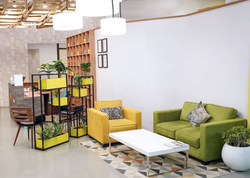
Analogous color schemes are a perfect palette for intertwining indoor plants within our interior landscape. Picture a living room painted in lush greens and radiant yellows, capturing the serene essence of a garden bathed in sunshine. Positioning green houseplants in tasteful planters throughout the room can accentuate this green-yellow analogous palette, drawing the richness of nature indoors.
Your walls are a canvas, and the room a tapestry
When working with analogous colors, treat your walls like a blank canvas. Select a dominant hue from your palette to color the walls and then introduce accents in its neighboring shades. This visually coherent stage accentuates the verdant presence of houseplants, forming an organic link between the room’s elements.
Furniture selection also offers a prime opportunity to weave in analogous colors while spotlighting houseplants. Opt for furniture pieces in shades that resonate with your analogous palette, perhaps the earthy spectrum of browns and greens. This strategic choice consolidates the room’s aesthetic narrative, setting the stage for your plants to take the limelight.
Accessories and accents act as the final stitches in the tapestry of your room design. Employ elements like throw pillows, drapes, and art pieces that resonate with your chosen analogous colors, echoing the hues of the plants. This synchronized design language fortifies the synergy between the color scheme and the natural elements, amplifying the room’s overall visual appeal.
The marriage of analogous color schemes and indoor plants in interior design creates spaces that harmonize nature and aesthetics. Infusing the calming greens of plants into an analogous palette instills a delicate balance and tranquility within the room. Dabble in analogous color play, and let the charm of houseplants breathe life into your interior design narrative.
III. The Art of Interior Design with Plants:
Moving on to interior design, plants aren’t mere accessories; they’re vibrant design elements that can powerfully elevate a room’s aesthetic. Let’s explore the art of integrating plants and how they can harmoniously play off your chosen analogous color palette.
Incorporating plants within your interior design scheme offers manifold benefits. They enhance the visual appeal of your space, actively purify your air, contribute to stress reduction, and connect to the natural world. They infuse your space with an air of refreshing and invigorating vitality.
The process of selecting plants should mirror your careful curation of color: consider the compatibility of your plant choices with your chosen analogous color scheme. Green plants shine in this role, offering compatibility with a spectrum of color palettes. They lend an element of depth, texture, and a sense of life and growth that naturally complements the harmony of analogous colors.
Use your imagination with plants
Imagine a room awash with warm analogous hues of red, orange, and yellow. Introducing green plants into this fiery tableau creates an exciting contrast, their vibrant foliage providing a refreshing counterpoint to the warm tones. This juxtaposition breathes life and vitality into the room, amplifying its aesthetic appeal.
Conversely, introducing plants with matching green hues in spaces defined by cool analogous colors such as blues and greens results in an elegantly integrated design. The plants echo the serene mood of the room, harmonizing perfectly with the color palette and further enhancing the calming atmosphere.
Incorporating plants into your interior design does more than beautify your space. The lush, green foliage of plants beautifully complements the chosen analogous color scheme, offering a burst of visually stunning, vibrant life. Welcome the dynamic beauty of plants into your interior design to enhance the harmonious balance of your space.
IV. Planters – The Finishing Touch to Your Color Story:
Just like the perfect pair of shoes can make an outfit, the right planters can effortlessly elevate your interior design. The secret lies in selecting planters that synchronize with your analogous color scheme. Let’s dive into the factors influencing your perfect planter choice, including their material, shape, and texture.
Creating a cohesive look is like conducting a symphony of colors. Aim to match your planters with the analogous color scheme for that harmonious tune. Opt for planters in hues that resonate with your palette, effortlessly integrating them into your grand design narrative.
But who says you can’t play a bit of jazz? To add an exciting twist, why not select planters that deliberately contrast with the color scheme? Imagine a room steeped in warm analogous hues, and then picture cool-toned planters in shades of blue or purple. The striking visual contrast would be like a cool breeze on a sunny day – totally refreshing!
Consider planters not merely as containers for your plants but as integral parts of your design ensemble. A calming analogous color scheme of blues and greens can be highlighted by the pure simplicity of white ceramic planters. This can create a visually arresting contrast while blending harmoniously with the overall design.
Pot Material and Interior Design with Plants
Consider introducing metallic copper or brass planters in a vivacious analogous color scheme of red, orange, and yellow. Their warm glow keeps up the rhythm of the fiery colors while adding a spark of sophistication.
The art of interior design lies in the details. Selecting planters that beautifully align with your analogous color scheme will amplify the aesthetic appeal of your room. Consider the material, shape, and color of your planters to ensure they elevate your design. After all, your planters are the chic accessories that complete your design outfit.
V. Going Backstage – Implementing Analogous Color Schemes with Plants:
Imagine creating a mesmerizing stage play with your interior design. You can direct a stunning visual performance in your living spaces using analogous color schemes and plants. Here’s your behind-the-scenes guide to crafting a masterpiece:
- Setting the Stage: Begin with your room’s size, shape, and layout. It’s your stage, and your color and plant actors need to harmonize with it. Ensure your chosen colors and plants complement the room’s proportions, creating a balanced and visually appealing set.
- Casting Your Colors: Select the leading role – the dominant color from your analogous color scheme. This shade will set the scene and mood for your room. Then, bring in your supporting hues that harmonize with the star color and each other. Lastly, cast your plant actors and their chic planters, ensuring they align with your color cast to enhance the overall aesthetic of your play.
- Plants – Your Star Performers: Don’t view plants and planters as mere props. They are vital members of your cast, playing crucial roles in setting the mood and enriching your design narrative. Remember, their roles should enhance the ambiance and contribute to the visual harmony of the analogous color scheme.
- Achieving Balance and Harmony: A compelling play isn’t about overloading the stage; it’s about balance, proportion, and the interplay between the actors. Distribute your analogous colors and plants throughout the room to create a harmonious ensemble.
Soon you will be a color design virtuoso!
By adhering to these key director’s notes, you’ll be a virtuoso of analogous color schemes, painting a living, breathing picture with plants and colors in your interior design. Consider your room’s dimensions, cast your colors, assign critical roles to plants and planters, and maintain balance and proportion. With this approach, your creativity will take center stage, crafting an inviting and harmonious space. Lights, color, action – it’s time for your interior design to take a bow!