Choosing the right colors in your interior design with plants and their pots can significantly enhance the look of any room. Using the color wheel—a tool that illustrates how colors relate to each other—can guide us in creating a visually appealing and inviting space. Let’s delve into the color wheel and see how it can help with our plant and pot selections.
Decoding the Color Wheel: The color wheel is divided into three types of colors: primary (red, yellow, and blue), secondary (green, orange, and purple), and tertiary (a mix of primary and secondary colors). Understanding the relationships between these colors allows us to coordinate our design choices better. Professional interior designers often rely on the color wheel when composing a color scheme for a new project.
Choosing Plant Colors
The color of your indoor plants plays a big part in setting the mood of a room. Here are some tips:
- Complementary Colors: Complementary colors are pairs found directly across from each other on the color wheel. Pairing plants with complementary colors, such as a red plant near a green one, can create an engaging and lively display.
- Analogous Colors: These colors are side by side on the color wheel. Using plants with analogous colors, like shades of green, can give your room a relaxed and harmonious feel.
- Monochromatic Colors: A monochromatic scheme involves plants with the same color or different shades of that color. This can give your room a sleek, unified look, offering a sense of tranquility.
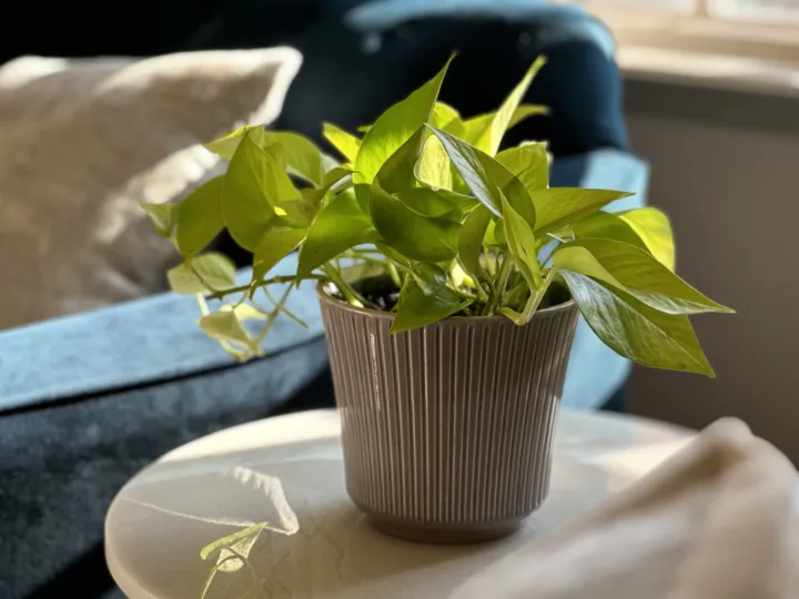
Selecting Pot Colors
The color of your plant pots can also significantly affect the aesthetic of your room. Here are some strategies for choosing the right pot colors:
- Contrast and Highlight: To accentuate the unique color of a plant, pick a pot that provides contrast. For instance, a blue pot could help a red plant stand out.
- Harmonizing Tones: If you want your pots to blend with the rest of the room, choose colors that fit in with the room’s existing color scheme. For example, a terracotta or beige pot could complement a room with many brown tones. For more on these ideas, see our recent article on using analogous color schemes in interior design with plants.
- Bold Choices: Choosing pots in bright, vivid colors can add an exciting element to your room. As long as it coordinates with the room’s overall color scheme, a brightly colored pot can be a fantastic addition.
A Great Start on Your Interior Design with Plants and Pots
By applying the principles of the color wheel, we can make informed choices for our designs. When we combine the right pots with our plants, we create an attractive and inviting space.